I set out to do something totally nutty when I envisioned this logo. Truth be told, my usual BFF designer, Steve Seybold, was just too busy making amazing things happen at Stitchfix to help me with this design, so I was a bit stumped.
Then another buddy piped up….”You’re an idiot! Just host a logo contest and put up a bounty and you’ll get a ton of great designs!”
Why didn’t I think of that!? That’s why we all need direct and frank friends in our lives. Sometimes we’re too close to the answer and just need that nudge.
I set up a 3-day branding contest at 99designs.com and figured I’d get a handful of designs. I decided to put up a $600 bounty, which was a bit strategic. A tad more than $500, and enough to get some of the better designers around the world engaged.
I posted around 6pm, went to dinner. After 2 hours, I had 40 submissions. Mind blown.
I was floored and realized I’d better set up a grading system quickly else I’d be inundated with too many to review. I decided to use 4 stars for the logos I really liked and I dismissed those that didn’t pass muster.
After sending notes back and forth to the contestants, I’d give a design 5 stars if I really felt that I’d actually use the design. I set out to find 10 5-star designs, thinking I’d likely find three.
I wanted something simple. Elegant. Large enough to see on a tiny podcast app alongside so many other podcast logos. Something that would be interesting embroidered on a hat. All those things. Oh, and using red and black as a nod to my Chinese heritage.
99 Designs leverages psychological tactics allowing everyone to see all submissions and my ratings. Within 24 hours, I had 150 submissions. To the chagrin of my family, I became obsessed with communicating back and forth with the designers, dismissing and commenting, making sure to thank each designer for their submission.
In the last 18 hours, I noticed that the submissions were starting to mimic the designs that I’d given 4 and 5 stars. I politely declined letting contestants know that their concepts were too similar to others that had been submitted.
Also, most of the designs had an overt microphone visual.
The logo that I chose has a very subtle microphone reference…
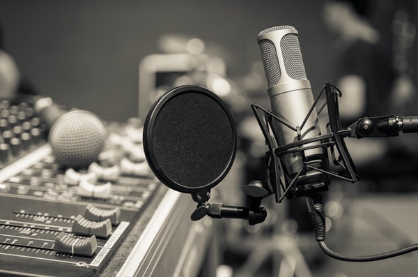
The butterfly-shaped rubber band mic shock is used by pros to reduce any noise the mic may get from the floor, table, or anything to which the mic is attached. It reminds me of my Dad and his days as a DJ and producer for Armed Forces Radio and Television.
The helix is also a subtle DNA reference. I also saw an M, and a D, and a person on the left talking to another person on the right. Like a mentor and mentee.
Everything about this logo screamed YES from the moment I saw it.
At the end of the 3 days, there were 500 submissions and I’d chosen 10 5-star designs. Absolutely nuts, in my opinion!
After some mental torture, I went back to my original creative brief and there was no doubt that this was the design that met all my requirements. AND the designer is a fantastic communicator which I know will be important as we continue with this brand. When he first sent the initial design, he said “I was subtle with the mic reference b/c you may want to branch out beyond podcasts.” Savvy!
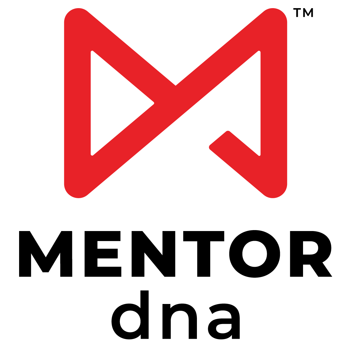
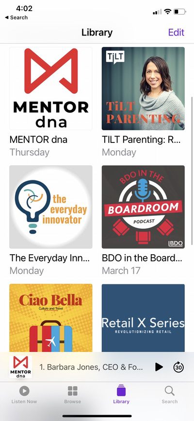
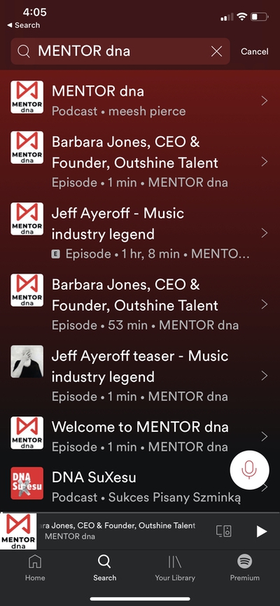
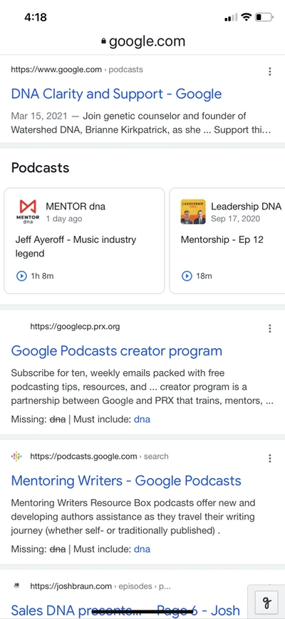


I love this bold and simple design. And though one of the non-winners was quite vociferous about why I chose the wrong design, it was even more evidence that I had chosen the right designer!
Thanks, Thomas!

